Saturday, November 28, 2009

Star plot

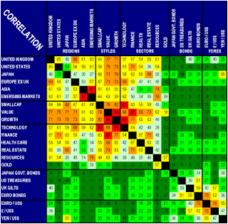
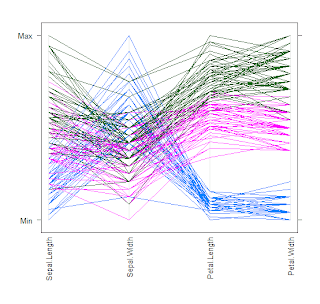
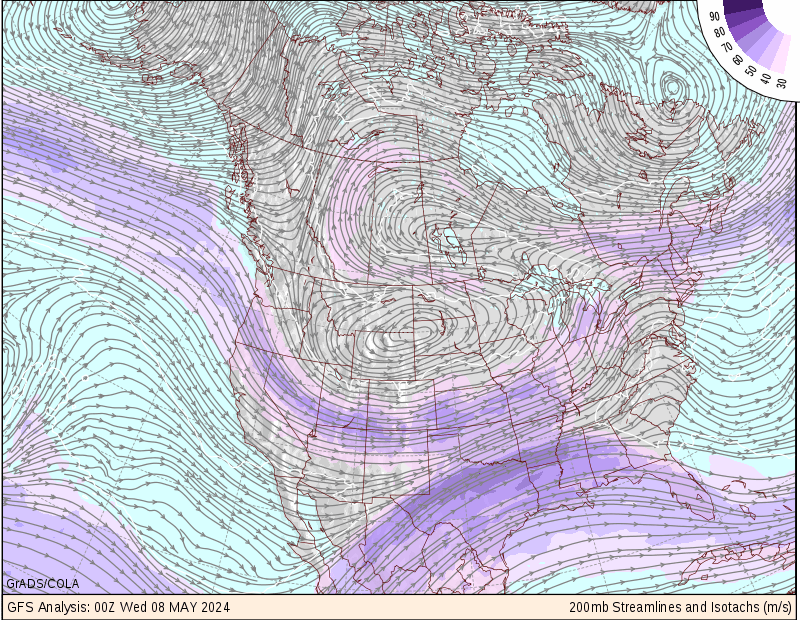
http://www.itl.nist.gov/div898/handbook/eda/section3/gif/starplot.gif


A star plot is a way of displaying multivariate data in the form of a two-dimensional chart of three or more quantitative variables represented on axes starting from the same point. The relative position and angle of the axes is typically uninformative. The above star plot contains the star plots of 16 cars.

Correlation matrix

http://images.google.com/imgres?imgurl=http://www.investors-routemap.co.uk/images/correlation.gif&imgrefurl=http://www.investors-routemap.co.uk/Guidebook_price_correlation.htm&h=537&w=546&sz=57&hl=en&start=9&um=1&tbnid=1H0tRrL_vvn0PM:&tbnh=131&tbnw=133&prev=/images%3Fq%3Dcorrelation%2Bmatrix%26um%3D1%26hl%3Den%26rlz%3D1T4GGIK_enUS281US281%26sa%3DN


A correlation matrix is where all correlations are obtained from the same set of observations.

Similarity matrix

http://tomcat.esat.kuleuven.be/txtgate/images/distmat.png


A similarity matrix is a matrix of scores which express the similarity between two data points. Higher scores are given to more-similar characters, and lower or negative scores for dissimilar characters.

Stem & Leaf

http://www.northstarmath.com/SiteMap/images/clip_image004_017.jpg


Stemplots retain the original data to at least two significant digits, and put the data in order.

A basic stemplot contains two columns separated by a vertical line. The left column contains the stems and the right column contains the leaves.

Box plot

http://onlamp.com/php/2004/07/22/graphics/boxplot.jpg


Box plots are also known as box or whisker diagrams. They are useful in comparing multiple sets of data because they display the median, the average, and the level or measurement of dispersion.

Histogram

http://www.cyber-wit.com/images/gallery/histogram1_b.png

A histogram is a graphical display of tabulated frequencies, which are shown as bars. It shows what proportion of cases fall into each of several categories. The categories (bars) must be adjacent. The intervals are generally of the same size.

Parallel coordinate graph

http://www.evl.uic.edu/aej/526/kyoung/Training-parallelcoordinate.html.


A parallel coordinate graph is used to plot large multivariate sets of data. One line in a parallel coordinate graph connects a series of variable of different values.

Triangular plot


http://www.pmel.noaa.gov/maillists/tmap/ferret_users/fu_2007/jpgCqrZqdDwYG.jpg

A triangular plot is where three variables which sum to a constant. It graphically depicts the ratios of the three variables as positions in a triangle.

Windrose

http://hem.bredband.net/aditus/chunkhtml/images/windrose_intro.png


A windrose is a graphic tool used to give a view of how wind speed and direction are typically distributed at a particular location.


Climograph

http://geography.ridley.on.ca/CGC1D/Students/Quebec2/Geo./Climographs_files/image003.png

A climograph is a graph of monthly average temperature plotted against average humidity. The monthly points are joined by a line. The shape and location of line thus drawn indicates the nature of climate in terms of heat and humidity. This climograph is of the Boreal Region, in Canada.

Population profile

http://www.pillarsoftruth.com/Images/PopulationProfile.jpg

A population profile shows us the age and number of people within a given population. This data is mapped in abundance through the Census program. This map shows the world's Islamic population.

Scatterplot

http://cnx.org/content/m10949/latest/age_scatterplot.gif

Scatterplot is a type of math diagram that uses Cartesian coordinates to display values for two variables for a set of data. The data is displayed as a collection of points, each having the value of one variable determining the position on the horizontal axis and the value of the other variable determining the position on the vertical axis. This particular scatterplot shows the correlation between ages of husbands and wives.

Index value plot


http://waterwatch.usgs.gov/regplots/real/real_us_2.gif

In an index value plot, an index value is plotted instead of an actually number. This type of plot gives a comparison, or normal, in order to base the values off of.

Lorenz curve

http://www.sarpn.org.za/documents/d0000990/images/lorenz_curve.gif


The Lorenz curve is used in economics and ecology to describe inequality in wealth or size. It is a graphical representation of the proportionality of a distribution (the cumulative percentage of the values).

Bilateral Graph


http://www.ustreas.gov/press/releases/images/november%20jobs%20graph.jpg


A bilateral graph is a form of visualization map where two related variables are identified as well as their overlaps.

Nominal area choropleth map

http://mapmaker.rutgers.edu/355/africa_political.gif


Nominal area choropleth maps portray areal data that area broken down by a group or category. This is a map that shows the different countries in Africa and their political view.

Unstandardized choropleth map

http://www.sfu.ca/unigis/images/price10.jpg


Unstandardized choropleth maps are unordered maps; there is no specific ranking assigned to the class - one category is not higher or lower than the other. This map is showing the percentage of vacancy in an unknown area.

Standardized choropleth map

http://www.bbc.co.uk/scotland/education/bitesize/standard/img/geography/population/g156.gif


Standardized choropleth maps show areas that are shaded or patterned in proportion to the measurement of the statistical variable being displayed on the map. The above map shows the population density of the world.

Univariate choropleth map


http://www.ats.ucla.edu/stat/sas/code/gmap.gif


A univariate choropleth map displays a single data set. The above map shows the distribution of household income for states across the US. Each income bracket is represented by a different color.

Bivariate choropleth map

http://www.geocities.com/stevejford/Africa_Choropleth.jpg


A bivariate map displays two variables on a single map by combining two different sets of graphic symbols. It is a variation of simple choropleth map that portrays two separate phenomena simultaneously. This particular map shows the GNP per capita and the life expectancy in Africa.

Unclassed choropleth map


http://www.cartisan.com/map_resources/map_types/images/choropleth.jpg


A Unclassed Choropleth map has a continous ramp of shading or color intensity that is used to illustrate a scale of data. The lowest and highest color intensities are assigned to the lowest and highest values respectively. A distinctive feature of unclassed choropleth maps is that each unique value has a unique shading of color.

Classed choropleth map

www.neighbourhood.statistics.gov.uk/HTMLDocs/

A classed choropleth map utilizes classification techniques to 'break up' intervals, which consist of: equal steps, quantiles, natural breaks and minimum variance.

Range graded proportional circle map


http://www.neiu.edu/~smkope/387/BasicPage/Proportional%20Circle%20Map.jpg

A range graded proportional circle map is a proportional circle map that depicts the circles in relation to ranges of data. The information is classified as equal quantiles, breaks, natural breaks, and minimum variance. This map shows the population of American Indians by location. It is measured by the thousands.

Continuously variable proportional circle map

http://www.volcano.si.edu/world/volcano.cfm?vnum=1501-08=&volpage=var


A continuously variable proportional circle map is a proportional circle map which utilizes circles to create point data. This relates the scales to the specific data. The circles are in proportion to the variable being measured. This map is a circle map of the volcanism in the Colombian region. Continuously Variable circle maps can be used to plot infinite points of variable sizes, here to show strength of volcanic activity.

Digital Orthophoto Quarter Quadrangle (DOQQ)

http://www.lacoast.gov/maps/doqq/lamap_for_doqqs2.gif

DOQQ's are available in Native and Geotiff formats. Native format quarter quads consist of an ASCll keyboard header followed by a series of 8-bit binary image lines for B/W and 24-bit band-interleaved-by-pixel (BIP) for color. Geotiff is a public domain metadata standard that allows georeferencing information to be embedded within a TIFF file. This is a DOQQ of coastal Louisiana in 1998.

Digital Elevation Model (DEM)

http://www.solarviews.com/raw/mars/marscyl2.jpg

DEM is a digital representation of ground surface topography and/or terrain. They can be represented as a raster or as a triangular irregular network. They are used often in GIS, and are the most common basis for digitally-produced relief maps. This digital elevation map of Mars was produced by the USGS from Viking image data.

DIgital Line Graph (DLG)


http://www.dlg.nsw.gov.au/dlg/dlgHome/documents/Downloads/MAP_LOCALAREASINNSWCOLOURED.jpg


DLG is a map feature represented in digital vector form that is distributed by the USGS. DLGs are collected from USGS maps and are distributed in large, intermediate and small scales. They show users maps ranging from a variety of topics, such as, transportation, contours, and public land survey boundaries as shown on the above map.

Digital Raster Graphic (DRG)


http://www.tceq.state.tx.us/assets/public/gis/images/drg.gif

A DRG is a digital image created by USGS that are typically scanned at 250 dpi and saved as a TIFF (a file format for storing images). The image usually includes the original border information, commonly referred to as the "map collar". DRG's are regularly used in GIS applications.

Monday, November 23, 2009

Isopleth


Isopleths are contour lines that joins points of equal elevation (height) above a given level, such as mean sea level. Isopleth maps, like this one, are handy in showing changes in the amount of acid rain resulting from legislative efforts such as Title IV of the Clean Air Act Ammendments. This map is from the 1995-2005 CAAA Reductions Report.

Isopach


An isopach map is a map that shows the variation of thickness within a tabular unit or stratum. Isopachs are contour lines of equal thickness over an area. They are used in stratigraphy, sedimentology, structural geology, and volcanology. This map is of the Geneseo Shale (thickness in feet).

Isohyets


Isohyets are lines that join points of equal precipitation on a map. This map is of Australia on September 23, 2009.

Isotach

http://wxmaps.org/pix/avnmr5.00hr.png


An isotach is a line of constant wind speed. The wind patterns are displayed over a map of the area the viewer is interested in. This map shows isotach patterns across the continental US.

Isobar


An isobars are lines drawn on a map joining places of equal average atmospheric pressure reduced to sea level for a specified period of time. This map was taken on May 6th, 1999. According to the site, the wind blew real hard across western South Dakota and portions of northeast Wyoming. The cause was the big "L" you see on the 12Z surface analysis above. Each isobar represents a 4mb pressure difference. Notice, there are 5 isobars over western South Dakota. There was a large 15mb pressure difference between the low and Rapid City.

LIDAR


Light Detection And Ranging (LIDAR) is an optical remote sensing technology that measures properties of scattered light to find range and/or other information of a distant target. This LIDAR map is of the New Orleans flooding from Hurricane Katrina.

Doppler radar


Doppler radar is a radar that makes use of the doppler effect to produce data about objects at a distance. It does this by beaming a microwave signal towards a desired target and listening for its reflection, then analyzing how the original signal has been altered by the object(s) that reflected it. Doppler radars are used in air defense, air traffic control, sounding satellites, etc. This doppler radar map was take on November 23, 2009.

Black and White Aerial photo


Aerial photographs of selected areas are realistic representations of terrain and landscape and do not suffer loss of information through generalization or coding of selected features. Aerial photography does not preselect objects to be captured and depicted. This is a map of a Fort Des Moines Archaeology Site Excavations.

Infrared aerial photo


Infrared aerial photography can be used to document changes in the environment, the health of forests, wetlands, bays and oceans. It can also be used to document and monitor such items as damage to roofs, the tracking of dairy farm out flows, pinpointing the source of, and monitoring, insect or disease infested vineyards, or sites contaminated by toxic chemicals, and many more applications. This map is of Massachusetts' ecostystem.

Cartographic animations

http://www.blacksworld.net/images/yahoo_traffic_animation_screenshot.png


Cartographic animations maps are a type of motion map that shows a before an the effects of an event to give you an after. This map does not use motion but the different lights do change between green and red depending on whether there is road construction in that specific area.

Statistical map


Statistical maps are expressed as rates, ratios, percentages, or other statistical measures. They are used to display the distribution of a certain variable over a geographic area. This statistical maps of the Internet was produced by John S. Quarterman in 1990.

Cartograms


Cartograms are a type of map where some type of thematic mapping variable is substituted for land area. The space of the map is distorted in order to show the information of this alternate variable. There are two main types of cartograms: area and distance cartograms. This map was of the 2008 Presidential election.

Flow maps


Flow maps are a mix of maps and flow charts, that show the movement of things from one location to another, such as the number of people in a migration, the amount of goods being traded, or the number of packets in a network. This map was created by Telegeography, Inc. This map shows countries with traffic flows between them represented as smoothly curving red lines. The thickness of the lines is proportional to the annual volume of traffic between those two countries, measured in millions of minutes of voice telecommunication.

Isoline Map

http://www.geographyteachingtoday.org.uk/images/uploads/FW_Updating_big4.jpg


Isoline maps are a type of thematic map. They use line symbols to show a continuous distribution such as temperature or elevation. Isolines are lines that connect points of equal numeric value. A contour map showing elevation above sea level is a type of isoline map. This is a map of Somerset. The strength of mobile phone reception in the area was looked at and plotted on isoline maps.

Proportional circle map


Proportional circle maps represent data associated with certain locations (cities or counties). The data is shown through proportionally sized symbols (circles) to show a difference in occurrence. This map was created by the Office for National Statistics.

Choropleth map


Choropleth are the most commonly used method of thematic mapping. They are suited for charting phenomena that are evenly distributed within each area. This map shows the Percent of People who are Hispanic per county in Florida based on Census data from 2000. The data is divided up into 5 natural breaks. That means the groups are divided into unequally sized groups that attempt to group like data together.

Dot Distribution map


http://www.wisconline.com map using dots to show the presence of a feature or occurrence and display a spatial pattern
A dot distribution map uses dots to show the presence of a feature or occurrence and to display a spatial pattern. This map shows census data of a Milwaukee county from 1990. According to the website each dot on the map represents 50 people. The map shows a density of people living near the urban areas. This map was used for protection of natural resources and the stress of population on the environment

Propaganda maps


Propaganda maps are a form of communication aimed at influencing the attitude of people toward some cause or position. It presents information primarily to influence its audience. This map was used during WW2. It was created in 1940 by the Nazi's to show that they are "passivists".

Hypsometric Maps

http://www.earthexplorer.com/2009-03/images/Figure-3---Topographic-hypsometric-map-of-Goiania-Metropolitan-Region_big..jpg

Hypsometric maps is a type of topographic map that shows elevations by contours by means of shading, tinting or batching. This map shows the elevation of the Goiania Metropolitan Region.

PLSS maps


Public Land Survey System (PLSS) maps are used in surveying and identifying land parcels. They are usually used in titles and deeds of rural, wild or undeveloped land. A PLSS maps shows its basic units in townships and sections. This map is of Alabama and shows all of its townships. The township of Franklin County is in blue.

Cadastral Map

http://www.jewishgen.org/galicia/assets/images/CadastralMapProject2.jpg


Cadastral maps are registers of metes and bounds of a place. They commonly include details such as ownership, tenure, precise location, value of individual parcels of land, etc. This map is of a section of Grzymalow Feldskizzon in 1852. During this time, these maps showed the smallest parcels of land, houses, barns, field plots, etc.